
I have worked on more than 25 Shopify stores over the past four years, from single-product direct-to-consumer brands to multi-category retailers with thousands of SKUs. The pattern that separates stores that grow from stores that stagnate is almost always the same: stores that fix their conversion flows before scaling traffic compound their revenue. Stores that pour media spend into a broken funnel compound their losses.
Every dollar spent on Facebook Ads, Google Shopping, or influencer partnerships is multiplied or divided by your store's conversion rate. A 1% improvement in conversion rate produces the same revenue impact as a 100% increase in traffic with zero increase in ad spend.
This post covers the four conversion flows we scope and optimize on every Shopify engagement before any marketing work begins. These are not minor tweaks.
Each flow, fixed correctly, produces measurable revenue impact within the first 30 days. I will include specific benchmarks for each and the exact changes that consistently move the needle.
Why Conversion Rate Optimization Beats Traffic Scaling
The average Shopify store converts at 1.4% according to Shopify's own benchmarks. That means 98.6% of visitors leave without buying. If your store is at 1.4%, getting it to 2.8% doubles your revenue from the same traffic.
If your store is at 0.8%, which is common for stores that have never had a CRO audit, getting to 1.4% produces a 75% revenue increase from identical traffic. No paid media channel can match that ROI because conversion rate improvements persist indefinitely while ad spend effects stop the moment you pause the campaign.
The stores that need CRO most are often the ones investing most aggressively in traffic. High ad spend masks a broken funnel because absolute revenue numbers look acceptable even at low conversion rates when volume is high enough.
The real cost is invisible: the revenue you would have generated from the same traffic at a higher conversion rate. Before any traffic scaling conversation, the first question should always be: what is your current conversion rate and where in the funnel is the largest drop-off?
Flow One: The Product Page
The product page is where purchase decisions are made. Every other page in your store exists to get users to the product page.
Optimizing this page has the highest leverage of any conversion work because it affects every session that reaches a product. The three variables with the highest consistent impact on add-to-cart rate are: product imagery, social proof placement, and mobile CTA visibility.
Product imagery in context, showing the product being used by a real person in a realistic setting rather than isolated on a white background, consistently outperforms studio-only photography in add-to-cart rate tests. This is especially pronounced in apparel, beauty, home goods, and lifestyle categories where the buyer is imagining themselves using the product. Lifestyle imagery above the fold, with studio imagery available for detail views, is the standard we recommend.
Social proof placement is the single highest-impact fix on most product pages we audit. Reviews and star ratings placed below the fold on mobile, which is where most stores put them, are not seen by a large share of mobile visitors who never scroll that far.
Moving the star rating and review count to immediately below the product title, visible without scrolling on mobile, consistently increases add-to-cart rate. On one client's product page, this single change, with no other modifications, increased mobile add-to-cart rate by 17% over a four-week test period.
Product Page Optimization Checklist
- Lifestyle imagery showing the product in use above the fold, not just studio shots
- Star rating and review count visible immediately below the product title on mobile
- Primary CTA (Add to Cart) button prominent, high-contrast, and fixed to the bottom of the screen on mobile
- Key product benefits summarized in three to five bullet points above the fold
- Social proof elements: number of reviews, number of customers, trust badges near the CTA
- Clear size guide or variant selector with no ambiguity about what each option means
- Shipping threshold or free shipping indicator prominently placed near the CTA
Flow Two: Cart Experience
Cart abandonment averages 70% across e-commerce according to the Baymard Institute, which has tracked this metric across thousands of sites since 2006. Most of that abandonment is not about price.
Research consistently shows that unexpected costs (shipping, taxes, fees revealed late in the flow) and friction (too many steps, mandatory account creation) are the top reasons users abandon. A clean, friction-free cart experience that builds confidence rather than creating doubt is the second highest-leverage conversion asset on a Shopify store.
The most impactful cart page changes are: showing product images with size/color selected (not just product titles), allowing easy quantity editing without navigating away, displaying the shipping threshold progress ('Add $12 more for free shipping'), and eliminating any step that requires the user to make a decision not directly related to completing the purchase. Cart page distraction, including cross-sells, promotional banners, and email capture popups, increases abandonment in most A/B tests unless the cross-sell is exceptionally relevant and low-friction.
We implement a persistent cart sidebar in place of a redirect-to-dedicated-cart-page model wherever the theme permits. The sidebar model, where the cart slides in as an overlay without navigating away from the browsing page, reduces the interruption to the browsing flow and allows users to continue shopping or proceed to checkout from the same view. For stores where this model is appropriate (catalog browsing rather than single-product focus), it consistently produces better checkout initiation rates.
Flow Three: Checkout Optimization
Shopify Checkout is largely standardized for stores not on Shopify Plus, but configuration choices still produce meaningful differences in completion rates. The highest-impact configurations are payment method diversity, trust signals, and mobile optimization.
Payment methods: international stores benefit significantly from offering local payment options (PayNow in Singapore, PayMaya in the Philippines, VNPay in Vietnam) in addition to credit cards and PayPal. In markets where these methods are preferred, adding them alone can increase checkout completion by 10 to 15%.
Trust signals at checkout, including SSL indicators, security badges, money-back guarantee language, and customer service contact information, address the anxiety spike that occurs when a user arrives at the payment entry screen. This is the moment when purchase intent is highest but anxiety about entering payment details is also highest. Trust signals that arrive at this exact moment are not redundant with trust signals on the product page; they serve a different psychological function.
Our benchmark is that no Shopify store should have a checkout completion rate below 55% on desktop or 45% on mobile without a specific diagnosed reason. If your checkout completion is below these thresholds, the most common causes are unexpected shipping costs revealed for the first time at checkout, too many form fields, no guest checkout option, and slow checkout load time on mobile. Any one of these issues alone can drop completion rate by 10 to 15 percentage points.
Flow Four: Post-Purchase Sequence
The post-purchase flow is the most underinvested conversion asset on most Shopify stores. At the moment a customer completes a purchase, they are at peak brand trust and purchase readiness. A relevant post-purchase upsell offered on the confirmation page, such as a complementary product, an upgrade, or a subscription option for a consumable product, requires no additional trust-building because it occurs after payment has already been made. Shopify research shows that post-purchase upsells converting at even 5% on a relevant offer add meaningful revenue monthly at zero additional customer acquisition cost.
Beyond the immediate upsell, the post-purchase email sequence shapes repeat purchase behavior. A well-designed sequence covers: an order confirmation email (sent immediately, with a clear expectation of next steps), a shipping update with tracking information, a delivery confirmation, and a review request at day 7 to 10 after delivery, timed to when the customer has had time to use the product.
Each email should have one clear purpose and one call to action. Sequences with multiple competing CTAs consistently underperform compared to single-focus emails, according to Klaviyo's benchmark data.
Why the Sequence of Optimization Matters
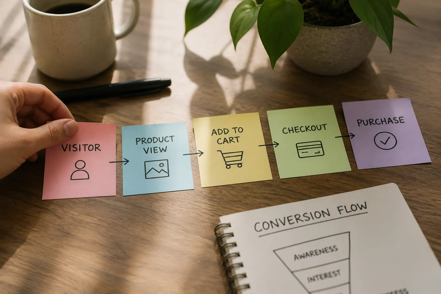
Optimizing the post-purchase upsell before fixing the checkout is like optimizing the dessert menu in a restaurant where half the customers leave before ordering their main course. Each stage of the funnel feeds the next one. Fixing the product page increases add-to-cart rate, which sends more users to the cart.
Fixing the cart increases checkout initiation, which sends more users to checkout. Fixing checkout increases completion, which sends more users to the post-purchase flow. Every improvement compounds through every subsequent stage.
This is the sequence we follow on every engagement, and it is why the stores we work with consistently see revenue increases within the first 30 to 60 days before any increase in marketing spend. The detailed results from our Shopify optimization work, including specific conversion rate improvements and revenue impact, are documented in our case studies. If you want a frank assessment of where your store is losing the most revenue, contact us to discuss a conversion audit.
Need help with this?
Growthtrait can help you put this into practice. Let's talk about your goals.
Contact us